Case Study
CASE STUDY — SERI KAYA ROYALE
- PROJECT TITLE
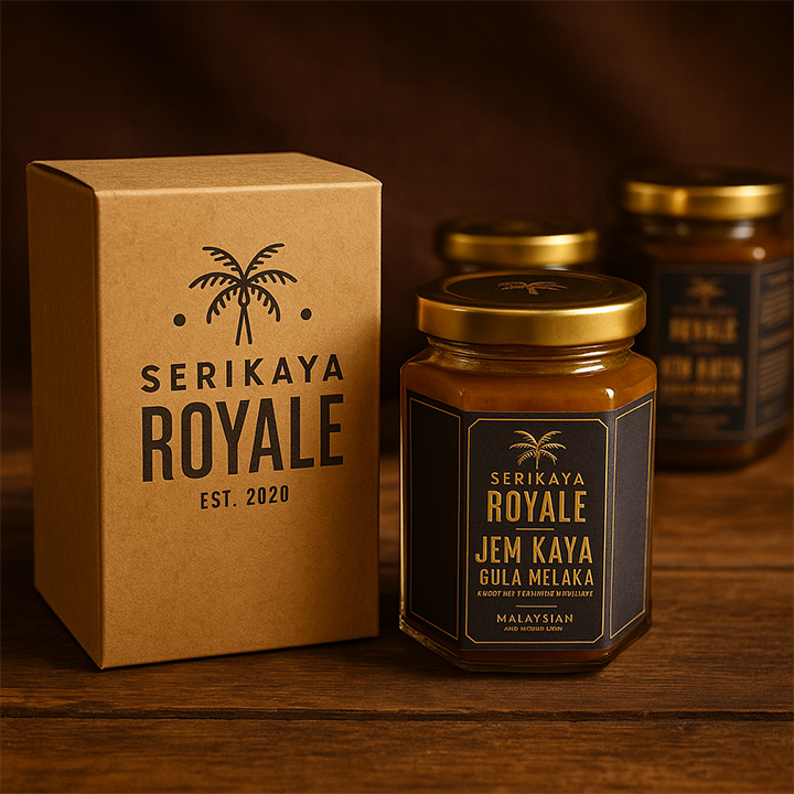
Seri Kaya Royale
Artisanal Coconut Jam Brand System - SHORT INTRO
Seri Kaya Royale was developed as a premium artisanal kaya brand aimed at elevating a familiar local staple into a more refined retail product. The objective was to build a brand presence that felt elegant, giftable, and commercially credible while still retaining the warmth and heritage associated with traditional coconut jam. - PROJECT OVERVIEW
Pixelworx Studio was engaged to shape the brand direction for Seri Kaya Royale through a focused visual system that could support both shelf appeal and long-term brand recognition. The brief required a balance between cultural familiarity and premium positioning — not merely to make the product look attractive, but to transform it into a more strategic brand asset.
This project centred on building a clearer market perception for the product through logo development and sticker/label application. The intention was to create a packaging presence that felt more elevated, memorable, and commercially viable for modern consumers.
- THE CHALLENGE
Kaya is widely loved, but many products in the category rely on generic visual treatments that struggle to differentiate on shelf or communicate premium value. The challenge with Seri Kaya Royale was to avoid looking overly common, overly rustic, or visually disconnected from its intended market.
The brand needed to:
- feel premium without becoming culturally cold
- preserve a sense of heritage without appearing outdated
- communicate quality through a clean and cohesive packaging language
- create trust and desirability at first glance
- THE STRATEGIC APPROACH
Pixelworx Studio approached the project through Asset Metamorphosis — turning a simple food product into a stronger brand-facing commercial asset.
The visual direction focused on:
- a more refined identity system to support premium perception
- a label presence that enhances product credibility
- a balance of tradition, softness, and elegance
- a packaging expression suitable for gifting, retail presentation, and digital promotion
Rather than treating the sticker as a decorative element, the system was considered as part of the wider brand intelligence of the product — helping the jar itself communicate quality, intention, and positioning.
- WHAT WE DEVELOPED
Scope of work included:
- logo direction for Seri Kaya Royale
- product sticker / label design
- brand presentation direction for product application
- packaging visual refinement for a more elevated shelf presence
- THE RESULT
The outcome was a cleaner and more premium-facing brand presentation that gave Seri Kaya Royale a stronger sense of identity and market readiness. The product moved away from looking like a generic homemade item and towards a more intentional brand system with higher perceived value.
The final direction supported:
- stronger visual differentiation
- improved perceived quality
- better suitability for premium retail or gifting contexts
- a more polished and recognisable product presence
- WHY THIS PROJECT MATTERS
Seri Kaya Royale demonstrates how even a familiar food product can gain new commercial strength when approached through strategic brand systems. By refining the identity and packaging layer, the product becomes more than a jar on a shelf — it becomes a brand asset with clearer positioning, stronger emotional resonance, and better business potential. - PORTFOLIO SUMMARY VERSION
Seri Kaya Royale is a premium artisanal kaya brand developed to transform a traditional coconut jam product into a more elevated retail and gifting proposition. Pixelworx Studio created the logo direction and product sticker system to build a cleaner, more refined packaging presence. The result was a stronger visual identity with improved shelf appeal, perceived value, and brand credibility. - WEBSITE EXCERPT VERSION
Seri Kaya Royale was crafted as a premium artisanal kaya brand with a focus on elegance, heritage, and commercial polish. Pixelworx Studio developed the logo direction and product label system to help transform the product into a more credible and giftable brand asset. - CTA LINE
Need a product brand system that looks commercially ready, not just visually pleasing?
Let Pixelworx Studio build the identity, packaging direction, and visual systems your product deserves.